From restaurant to listening bar
Patico started life as Patico D’Estambol, an earlier restaurant concept built around Sephardic cooking — a cuisine that was a fixture of Istanbul’s tables until the early 1900s. Coming back to it, we narrowed the idea from a full restaurant down to a bar: a listening bar, a speakeasy in spirit, with a short, curated menu that changes with what’s in season. The wine list and the cocktails follow the same rule.
The audience was clear from the start: a culturally fluent, design-driven crowd that comes for the sound, the taste and the atmosphere.
“A listening bar reimagining Sephardic flavors through contemporary Mediterranean culture.”
Sıraselviler 58
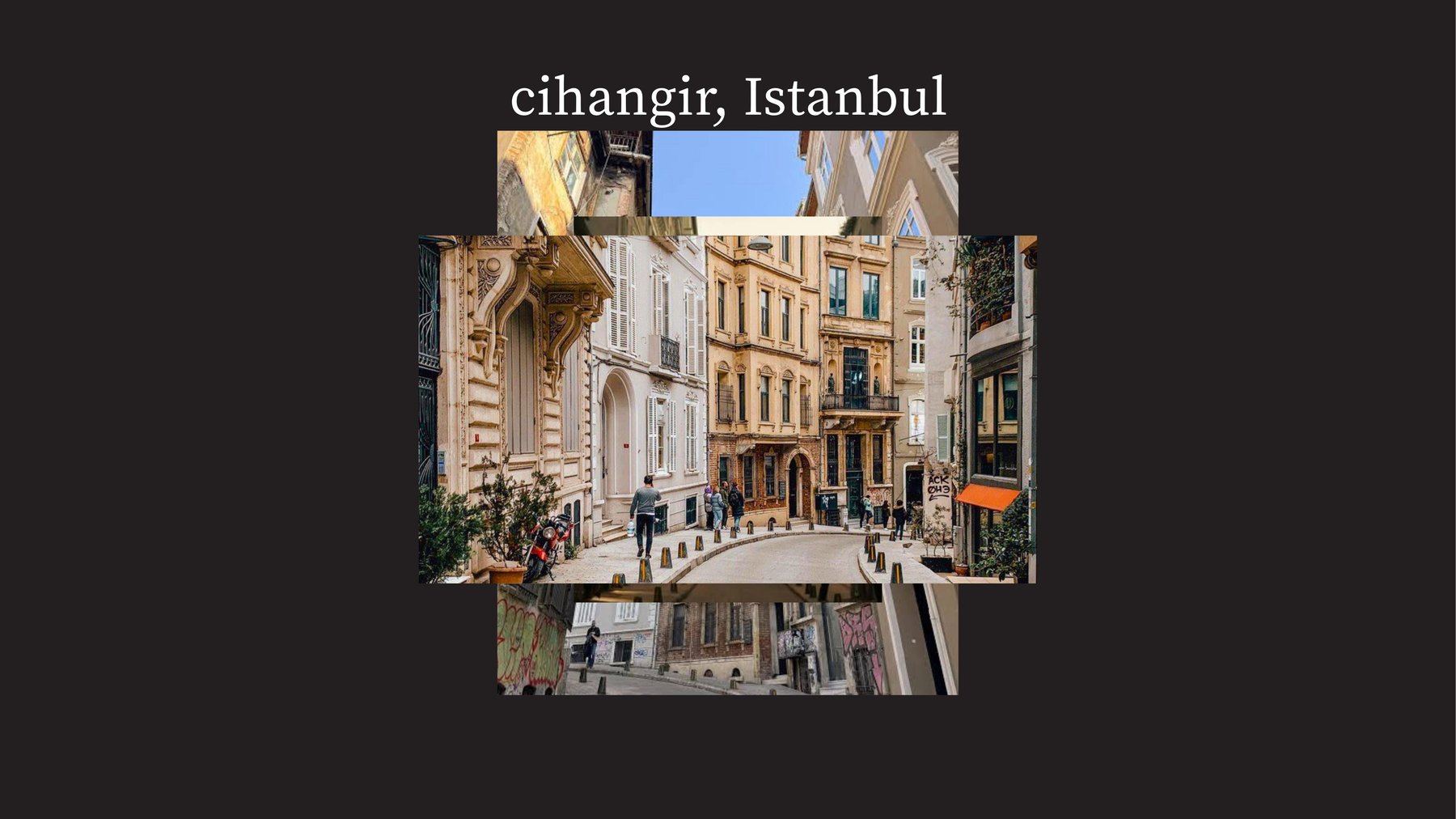
The bar sits at Sıraselviler Caddesi No. 58, in Cihangir — the bohemian corner of Beyoğlu, known for its artistic, intellectual atmosphere and the narrow, steep streets that drop towards the Bosphorus. The neighbourhood set the tone before any design did.
The room
We started with materials rather than graphics: raw concrete, dark oiled wood and brushed steel — surfaces that age well, take candlelight and leave room for the food. The moodboard set the register for everything after it: late nights, flash, hands, plates, records.


Imagery
The imagery is a tightly curated series of AI-generated photographs, art-directed to feel like a night at the bar shot on a point-and-shoot: direct flash, warm tungsten, grain, cropped hands and half-finished plates. Nothing is styled to look perfect; it’s meant to feel like you were there.


The wordmark
The name is set in Patico Geometric, a display typeface we drew for the bar. Its sharp, angular forms take their cue from the structure of the Bosphorus Bridge and the architecture of Cihangir, and the bridge is the idea underneath it all: a connection between East and West at the core of the identity.
The wordmark is built on a strict grid and comes in four sizes — Mega, Big, Medium and Small — so it holds together from a storefront down to a matchbox.


Typography
Two typefaces with clear jobs. Patico Geometric is the voice: the logo, display lines, item titles and section headers on the menus and social posts. Source Serif Variable does the reading — menus, the website, printed matter, anything where clarity matters. Its weights carry the hierarchy, while tracking and leading are left to the designer’s judgement, so it can flex to each format.


Colour
Three colours, named in Ladino and Spanish: Porto-Kal — the Ladino word for orange — Blanco and Negro. Porto-Kal is the signature, on the awning, the window frame and the matchbox; Blanco and Negro do the quiet work around it.
Everything else is borrowed from the kitchen. Secondary colours change with what’s in — olive green, the silver of a fish skin, a deep wine-dark red — so the brand shifts with the menu.


Felt rather than seen
The identity is applied with restraint. The brand appears only where it’s needed, leaving room for the materials and the food; the type and the logo work as quiet markers rather than decoration.
Across print, digital and the room itself, the brand travels through texture, tone and atmosphere instead of overt graphics — so it feels built into the experience, not placed on top of it.
In the room
On site, the mark turns up where a hand or an eye naturally lands: the awning and the Porto-Kal window frame, the rim of a plate, an apron, the DJ’s sweatshirt, a matchbox, a steel ashtray stamped with the name.


On the feed
Social follows the same rules as the room: the photography leads and Porto-Kal frames it. Story templates carry the hours, events and specials, set in the two typefaces.


Menus
The menus are single printed sheets clipped together with a Porto-Kal tag, so they can be reprinted as often as the kitchen changes its mind. Mezzes to start, tapas to share, mains and desserts in one column; reds, whites, rosés and naturals in the other. Handwritten notes on the sheet are part of the design.


Why restraint
A bar like this lives on atmosphere, and atmosphere is easy to overdesign. So the system is built to step back: one colour that does the heavy lifting, one typeface with a strong voice, and everything else left to the room, the food and the music.
“Patico favors longevity over visibility — a brand that is felt rather than seen.”