One letter first
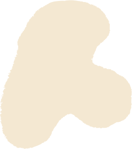
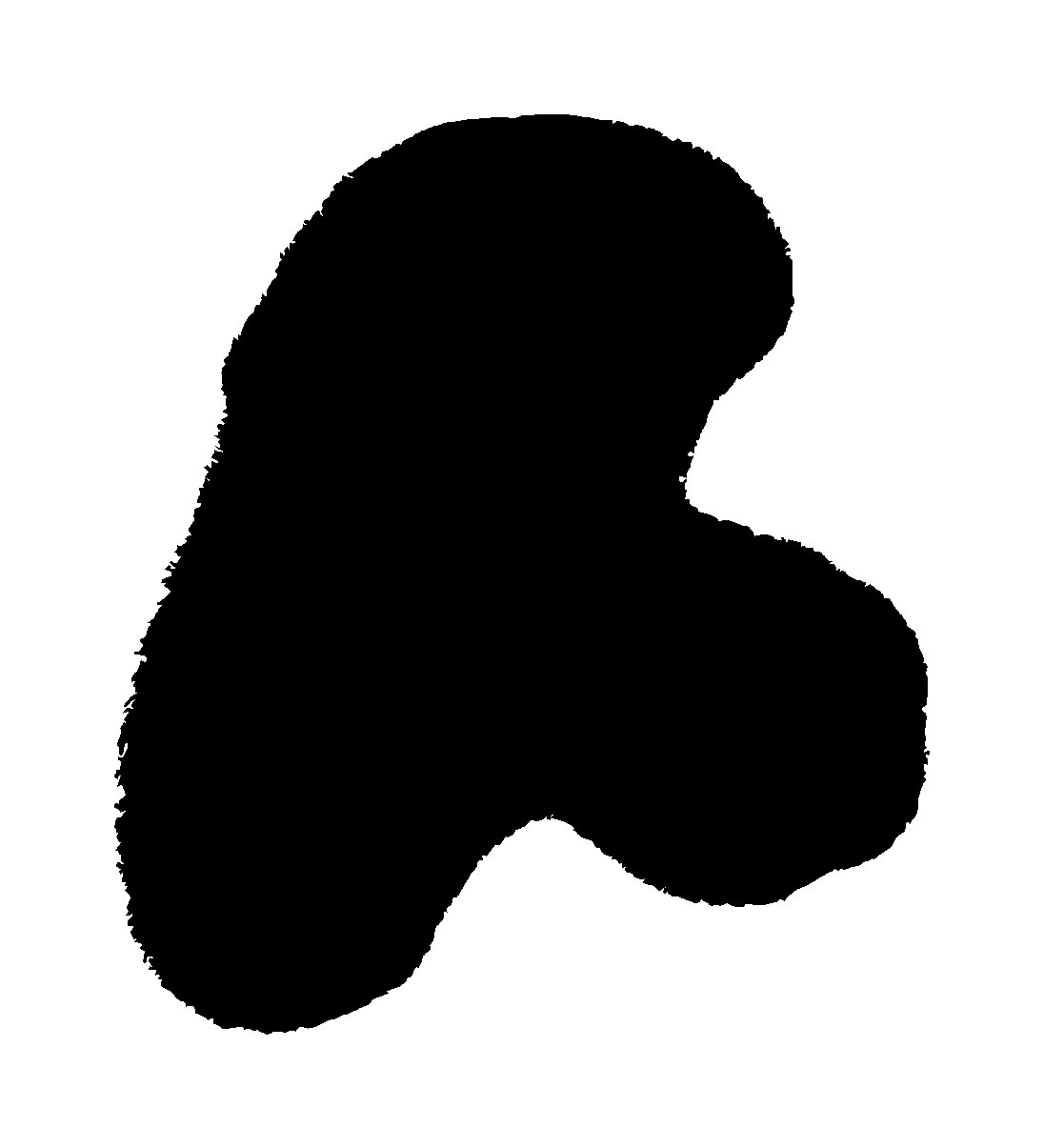
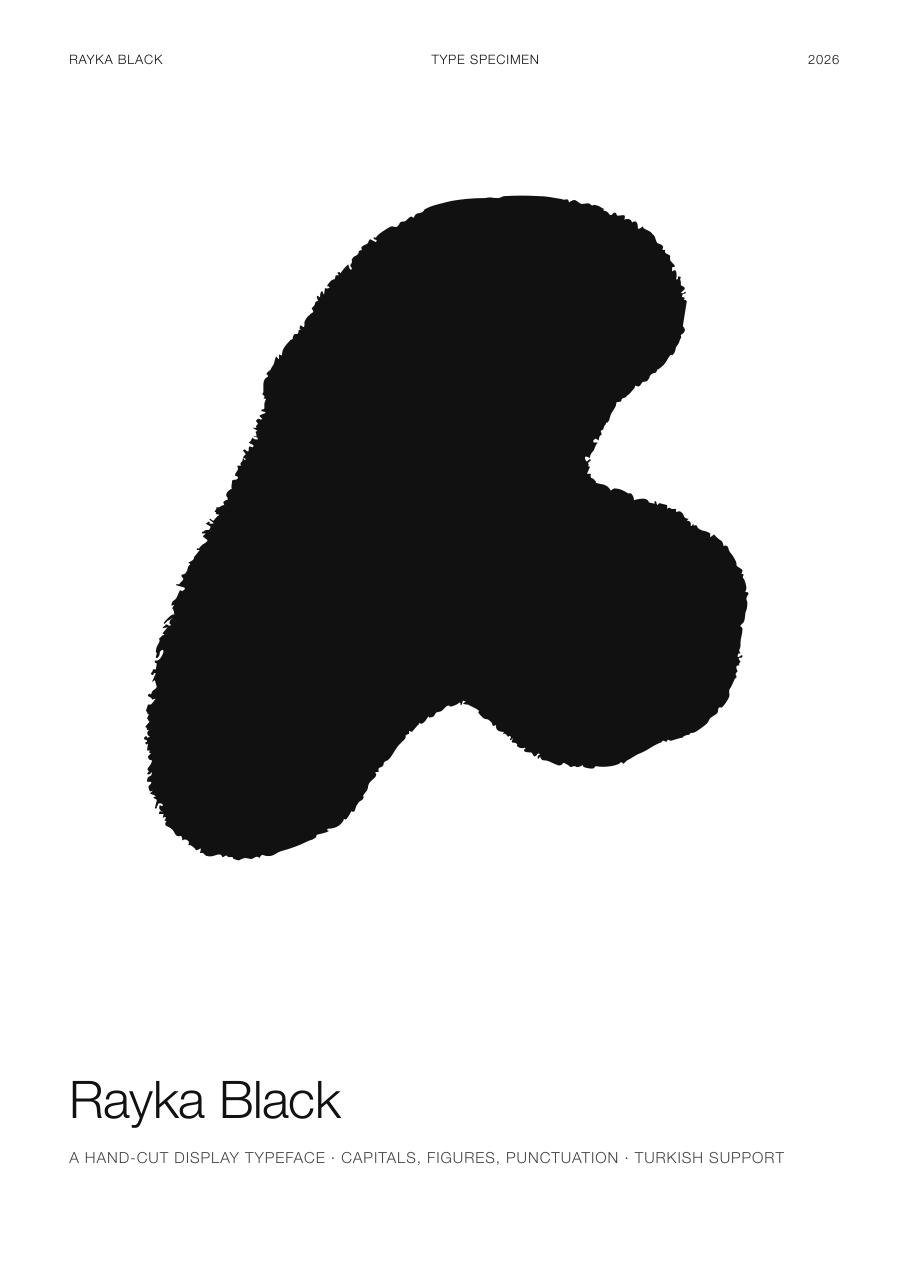
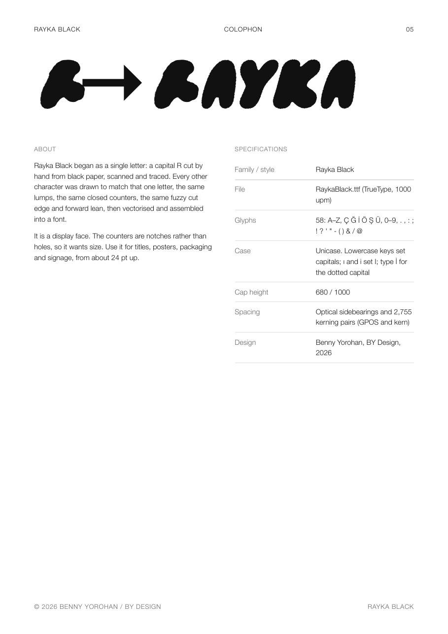
Everything in Rayka comes from one object. I cut a capital R out of black paper with scissors, freehand — no sketch, no grid, just the shape the scissors wanted to make — then scanned it and traced it. The cut made four decisions for me: the bowl closed into a solid lump instead of a hole, the leg became a short stub ending in a round ball, the whole letter leaned forward, and the edge kept a fine fuzz from the blade. Those four accidents became the rules of the typeface.
Then the rest
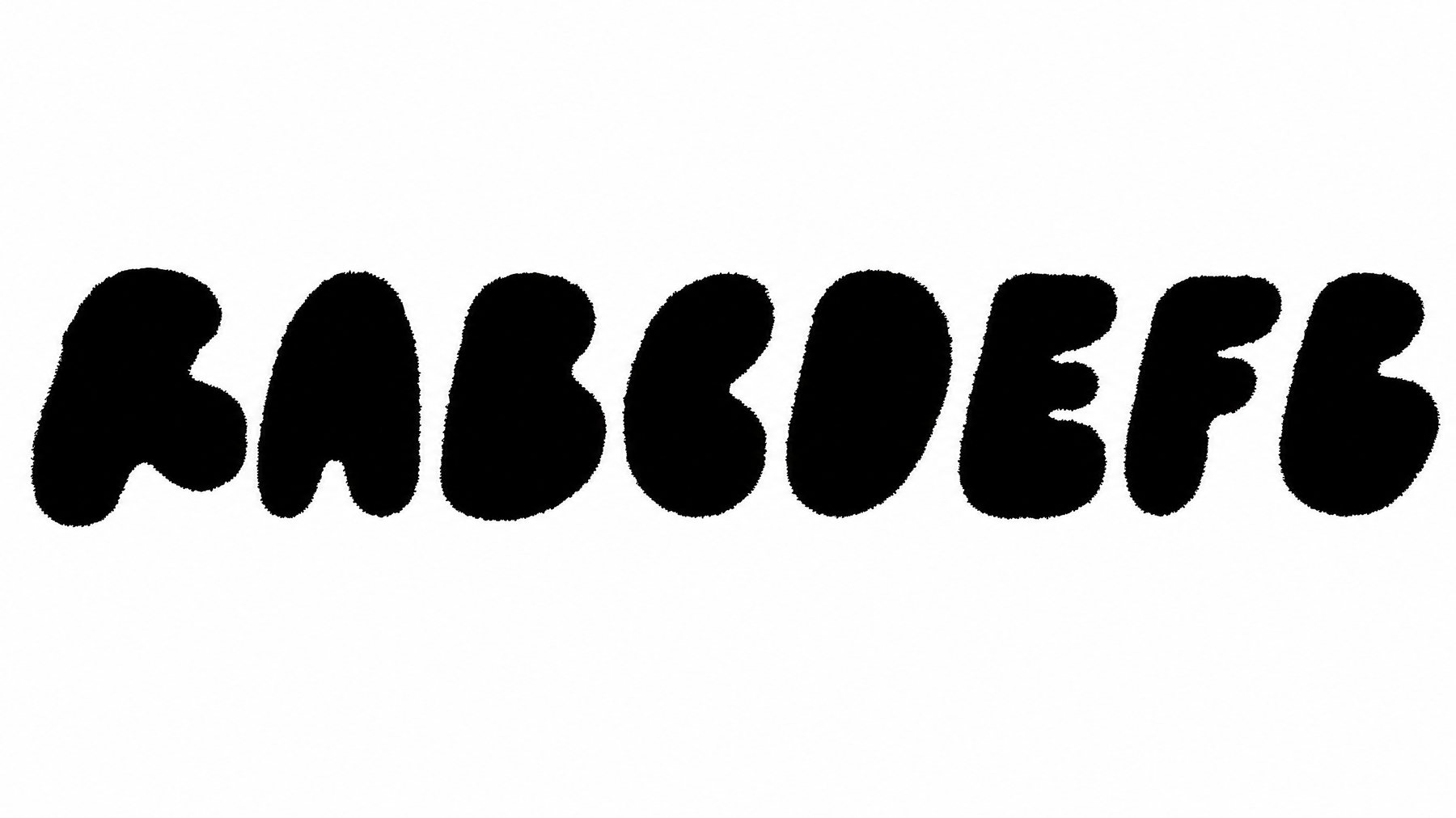
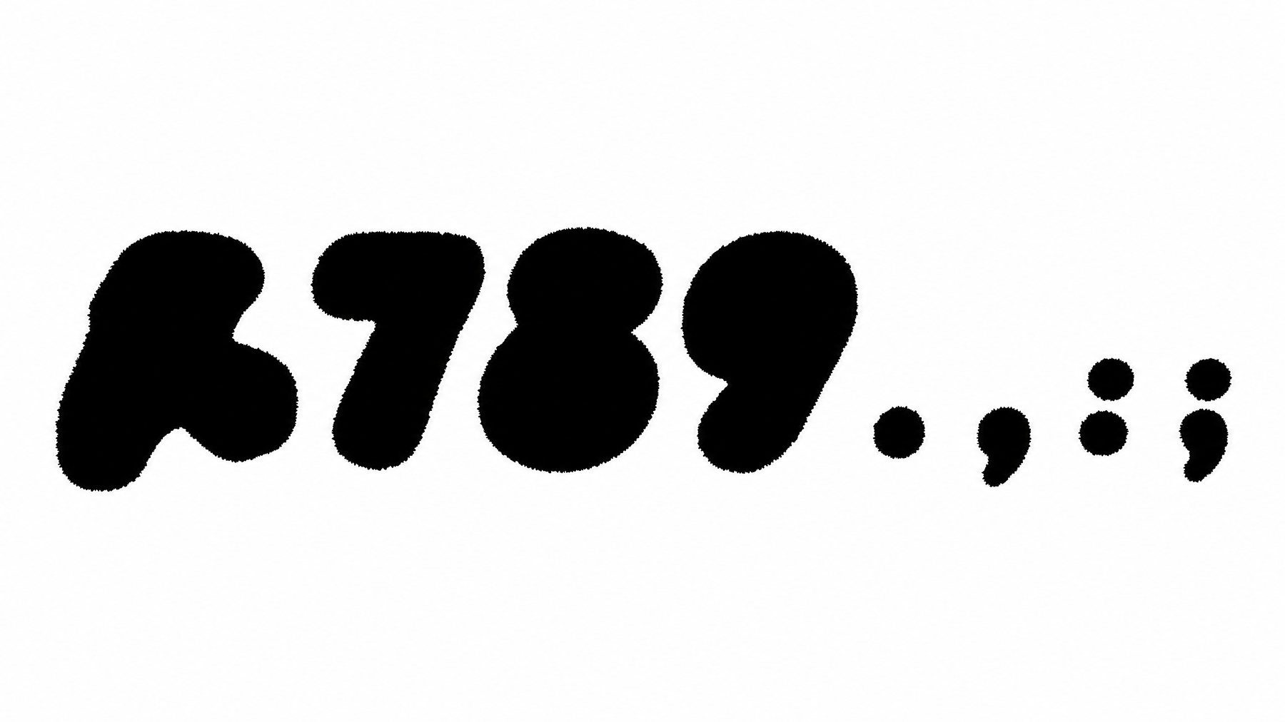
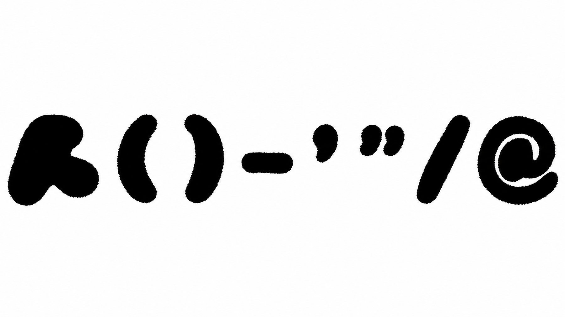
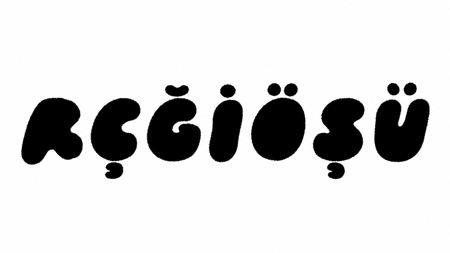
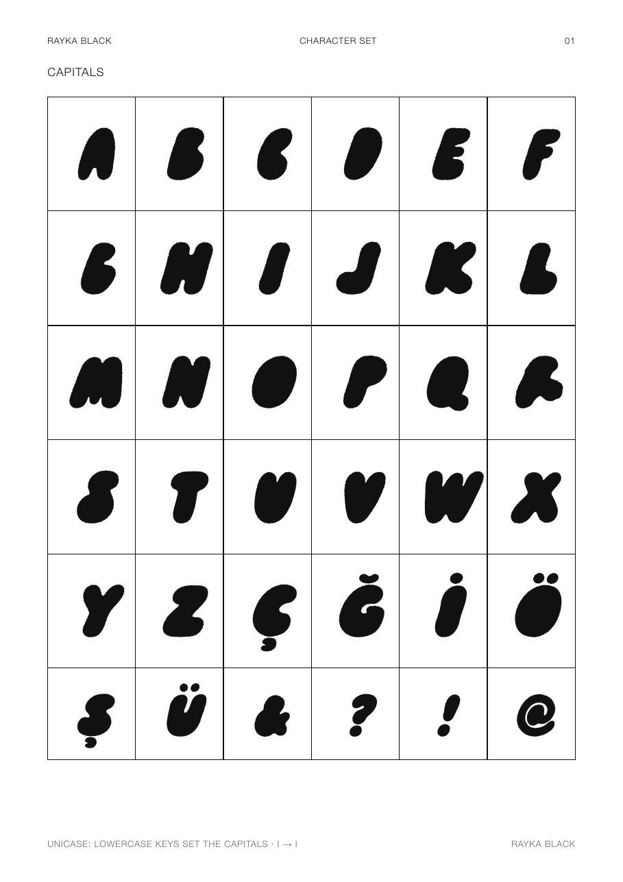
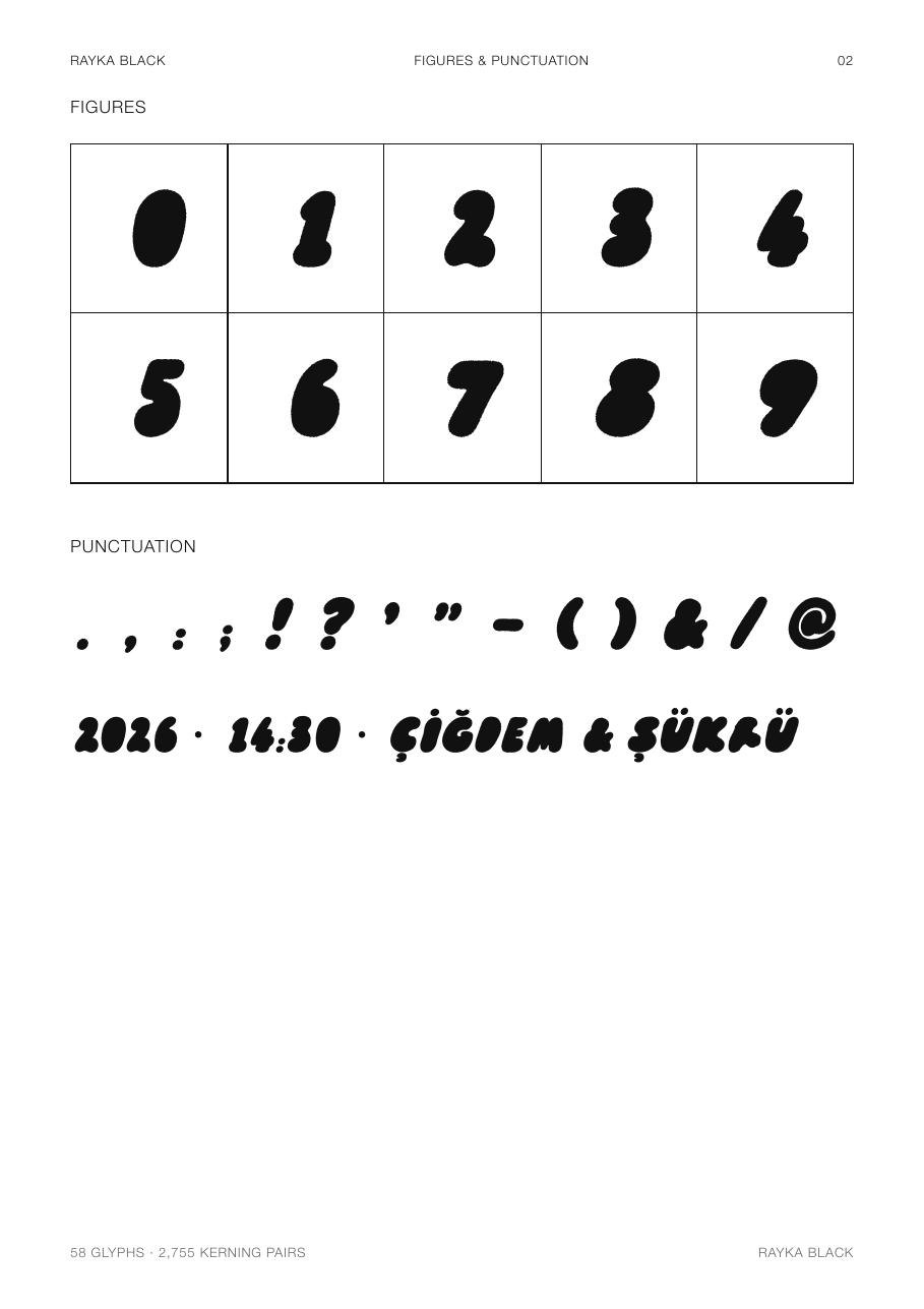
I didn't draw the other fifty-seven characters — I described them. The R went into an image model as the reference, alongside a written specification of its construction: solid rounded lumps, counters closed or tiny, the same stroke thickness, the same forward lean, the same fuzzy hand-cut edge, every letter the height of the R. The model returned the alphabet in rows — eight sheets, with the original R riding along in each one as the control sample. Some rows came back right the first time; others took several attempts before the lumps agreed with the R.
Then the engineering, which is where the typeface actually became a typeface. Each sheet is thresholded and split into connected shapes, and the pieces are grouped into characters — the dots of the question mark and the strokes of the double quote find each other by overlap. Every character is traced into cubic béziers, then each row is normalised by its own full-height letters so that everything sits on the R's baseline at the R's cap height. A 7° forward slant is applied about the baseline. Sidebearings are optical: each glyph's leaning edges are measured row by row and centred in a fixed gap. Kerning is computed the same way — the real gap between every pair of neighbours, sampled top to bottom — which produces 2,755 pairs. fontTools assembles it into TrueType, with GPOS and legacy kern tables, and one deliberate decision: the font is unicase. Lowercase keys set the capitals, ı and i both set I, and İ keeps its dot.
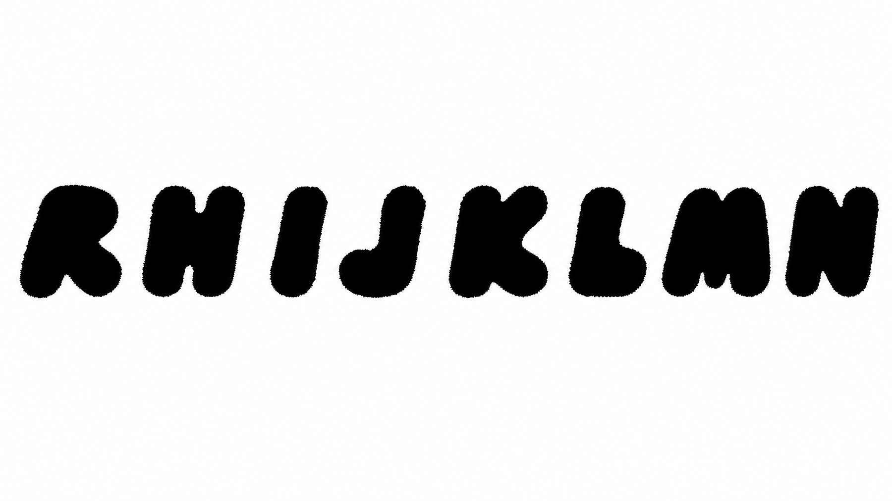
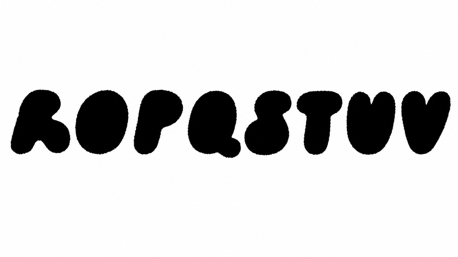
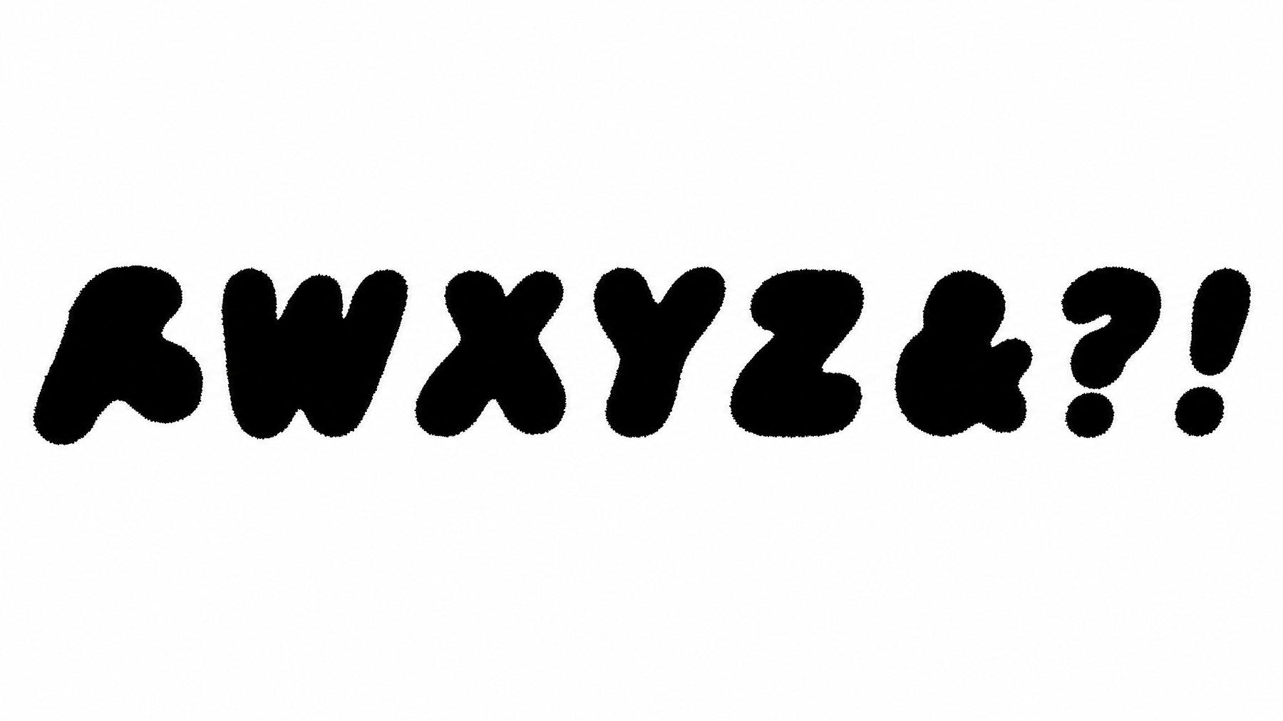
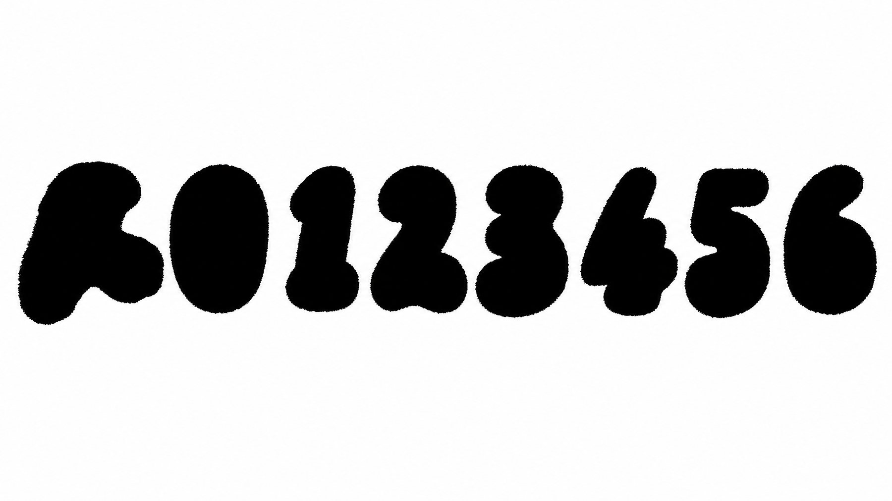
The typeface
Colour
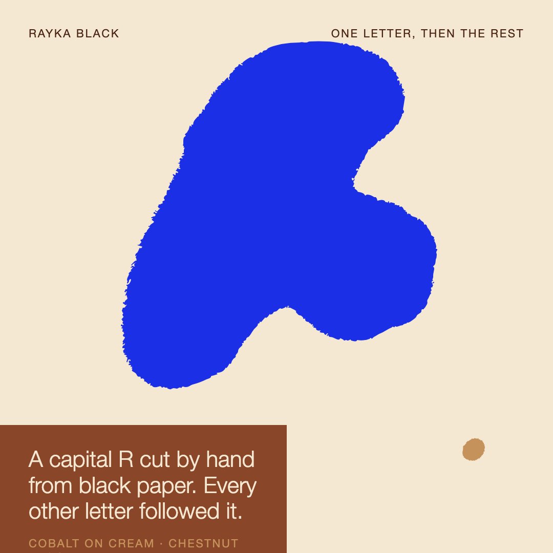
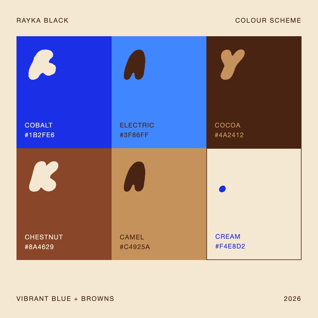
A letter this heavy carries colour like a wall does. The identity runs on two blues and four browns — cobalt against cream for the loud moments, chestnut and camel when it needs to warm up, cocoa for depth, electric as the accent — and the letters take every combination without losing their shape.
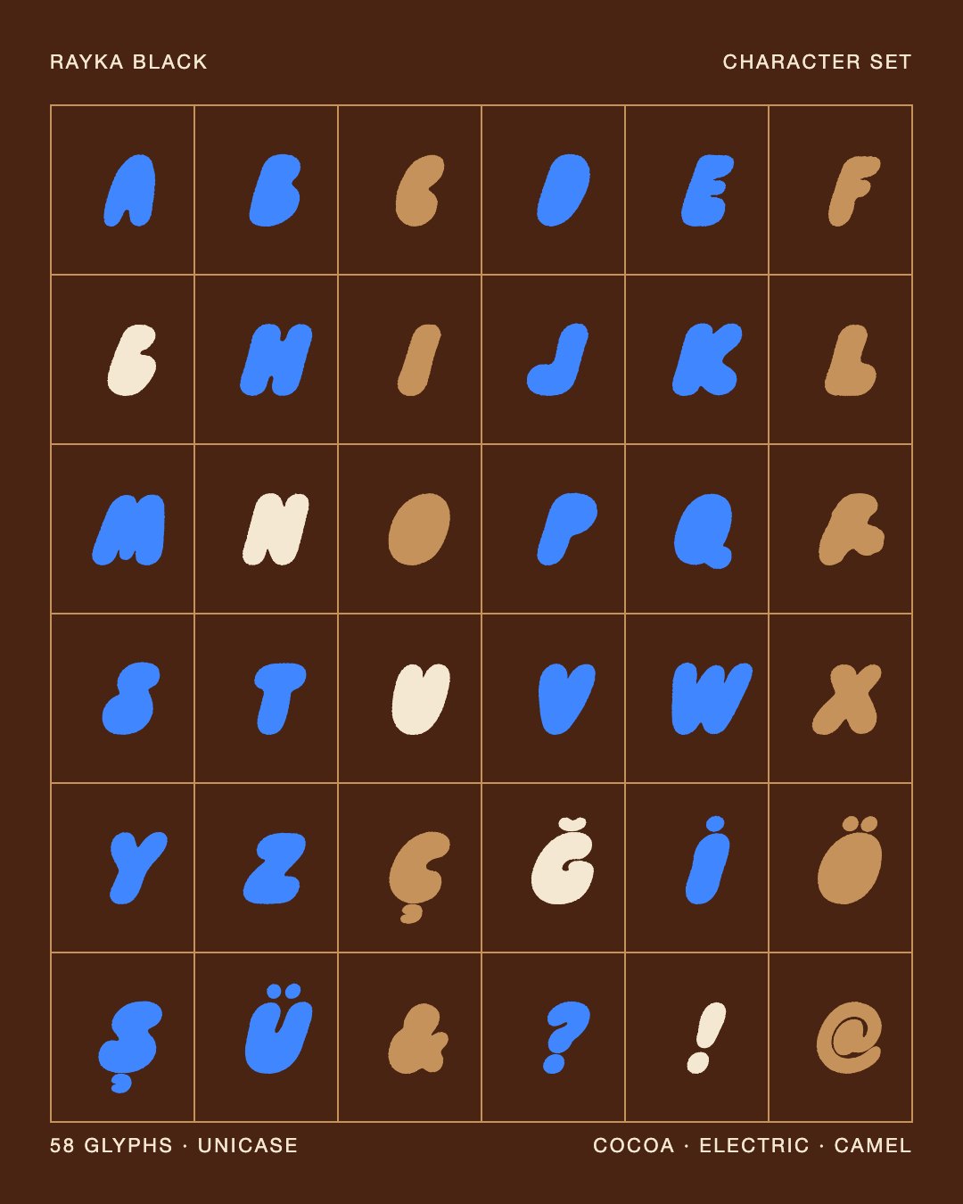
In use
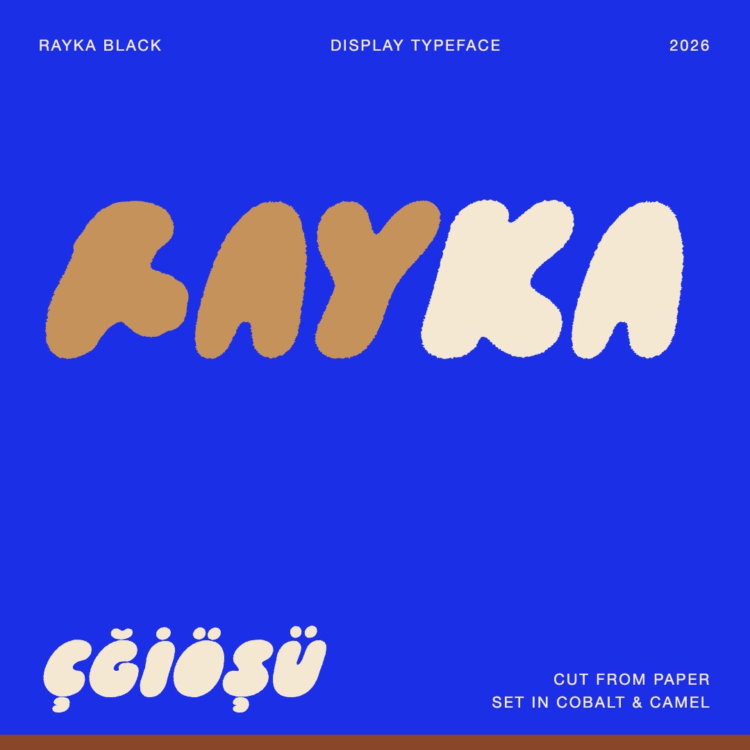
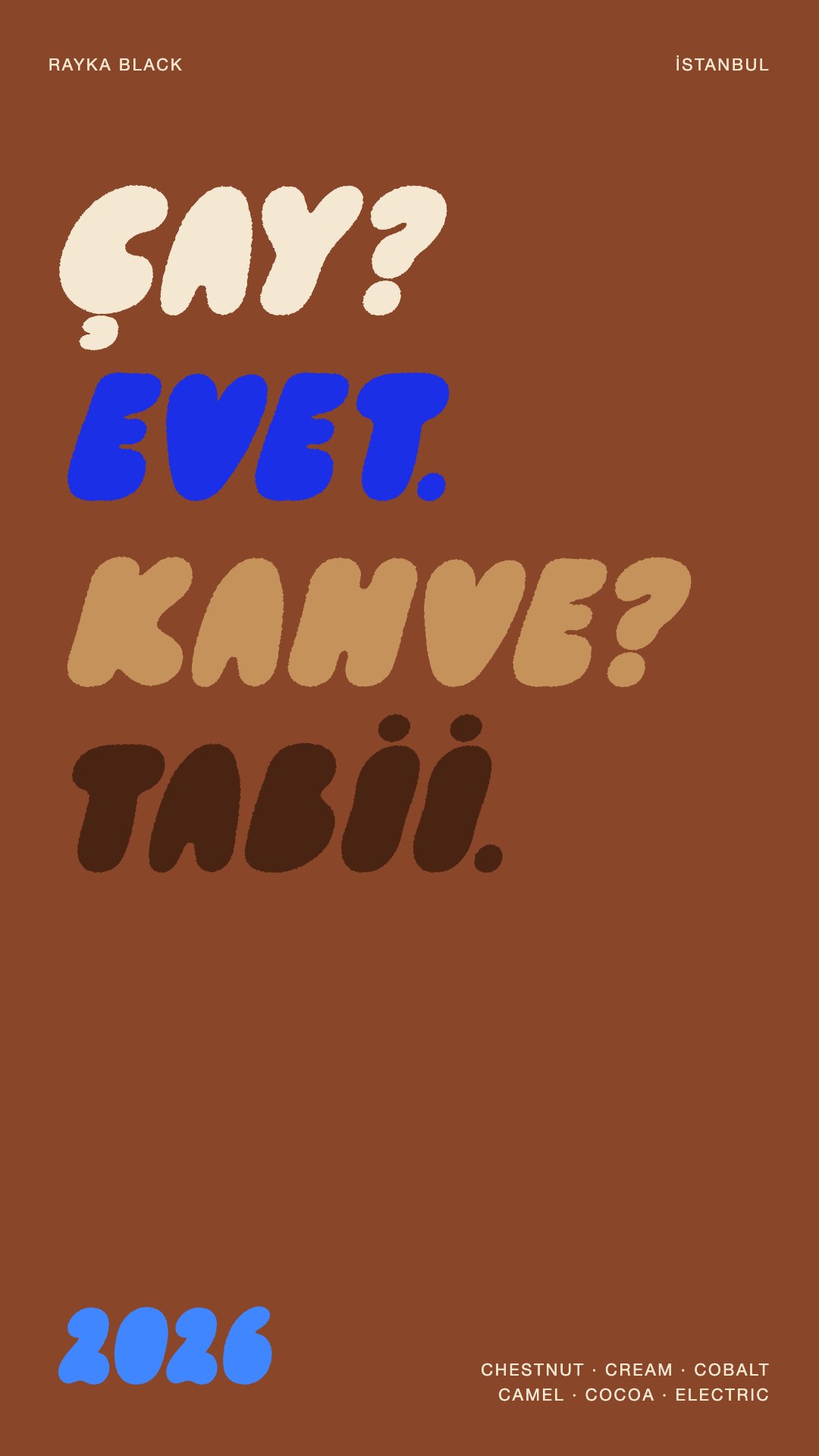
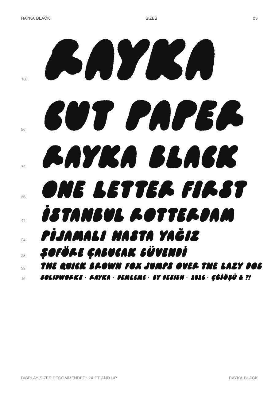
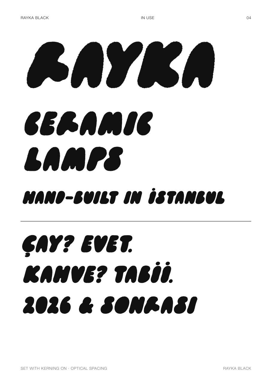
Rayka is a display face — the counters are notches rather than holes, so it wants size. Titles, posters, packaging, signage, anything from about 24 pt up. The identity pieces and the printed specimen put it to work: a name on cobalt, a conversation about tea and coffee on chestnut, a ceramic-lamp brand that doesn't exist yet.
Why one letter
Most typefaces start with a system and derive the letters from it. Rayka runs the other way: the system was reverse-engineered from a single object that already existed, cut in a few seconds, with all its accidents intact. The interesting part was refusing to clean those accidents up — letting a machine copy the lumps and the fuzz faithfully, and then spending the real effort on what only careful engineering can do: baselines, slant, spacing, kerning. The hand made the character; the code made it a font.
“The hand made the character. The code made it a font.”